Koreo
—
Identity, Print & Web for a Social Change Agency
They've been doing great things for nearly a decade but their brand didn't allow them to celebrate their stories in a way that did it justice. With their new name, came a new found confidence in what they were doing and they needed an identity to match.
Koreo are a brilliant company that help People, Organisations and Networks tackle the real issues that society face everyday. They have a belief in the power of we rather than I, and they really celebrate that strength.

A face for Change
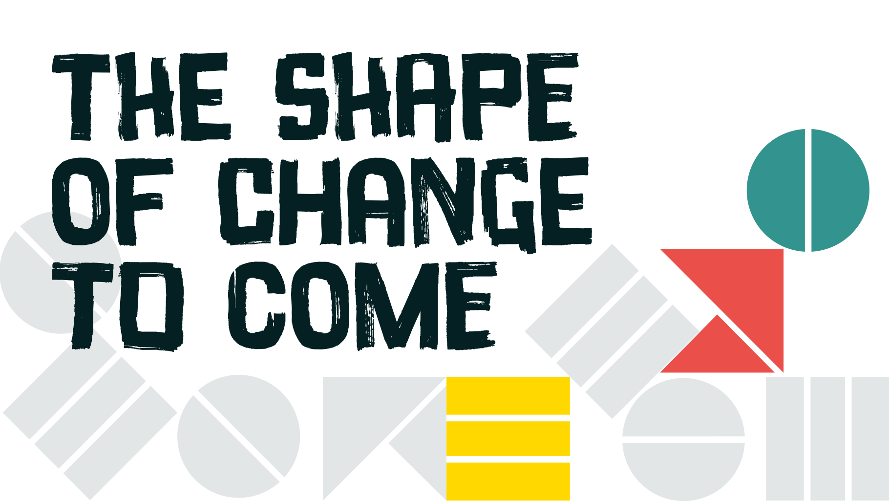
As part of the identity I created a bespoke hand-drawn typeface to capture the energy and attitude of what Koreo do. Koreo Hand is a mixture of anarchic rebellion and considered emotion.
Every character has 2 versions, a squarer version, and a softer rounded version—allowing every communication to feel fresh and hand drawn.

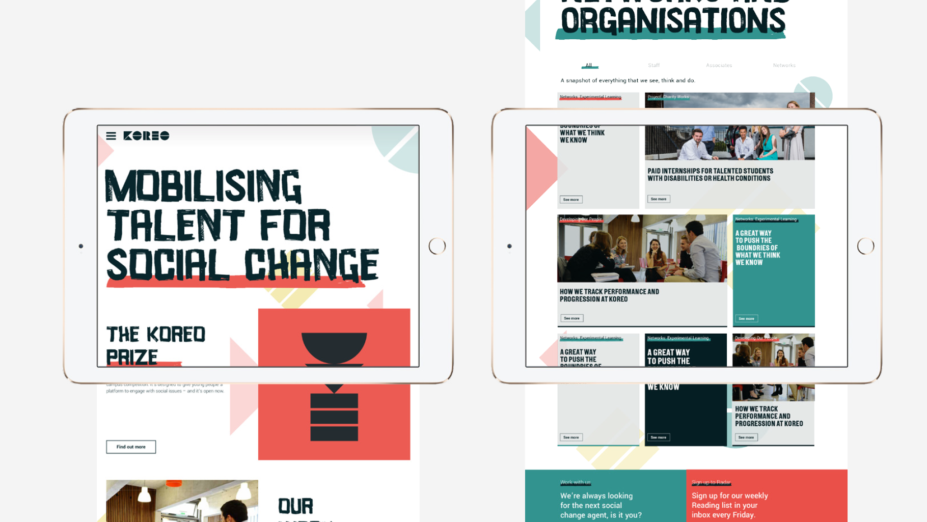

An identity with stretch
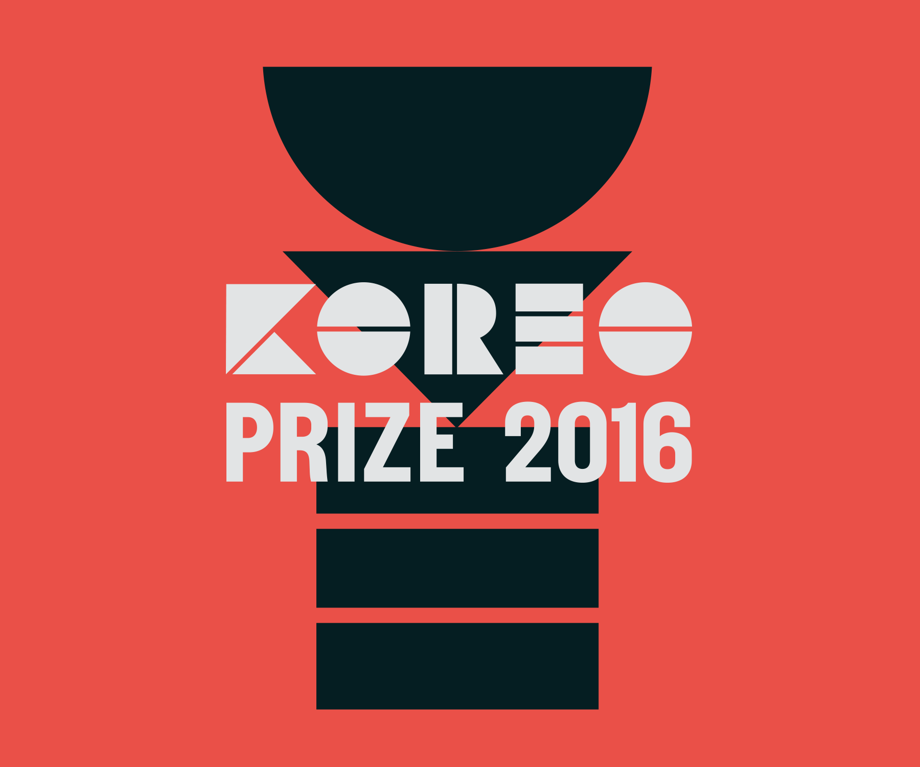
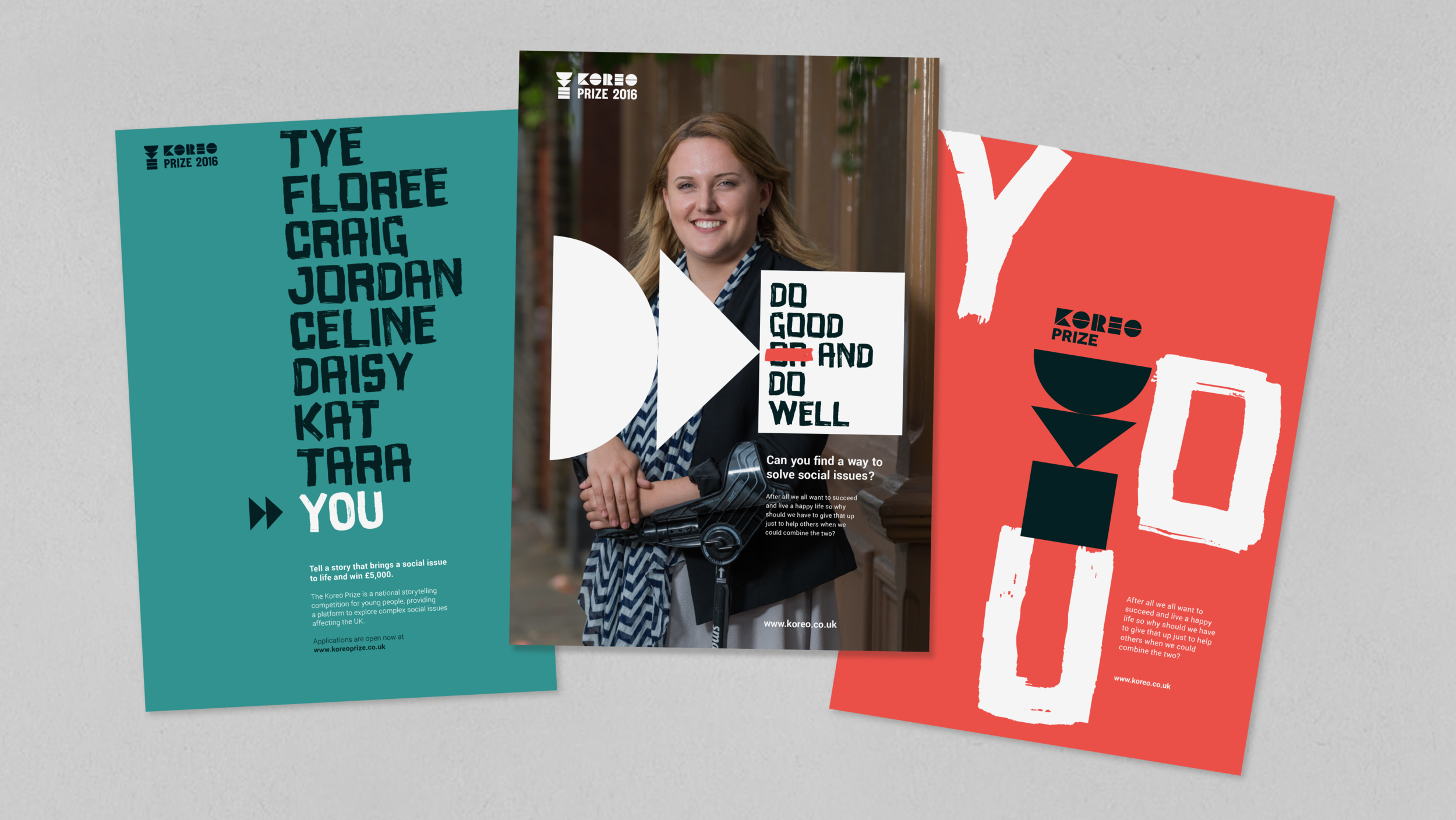
Part of the brief was that the identity was flexible enough to stretch to their branded ventures and schemes—something that they had previously struggled with.
The result was to create sub-brands built on the same shape as the master brand but with a slant relevant to each venture. Such as the Koreo Prize scheme where the shapes were used to create the award.